When the organization is the design problem
A 60-product platform redesign that needed the company to understand what it sold in the first place
CLIENT
PointClickCare
Timeline
8 months
Role
UX architect & design lead
We put a room full of stakeholders together and asked them to describe one of their core products. No one gave the same answer.
They had sixty products. Five hundred pages talking about those products. And a navigation system that, everyone agreed, was the problem.
It wasn’t.
The real problem was that the organization didn’t have a shared model of what it sold, how its products related to each other, or how to talk about any of it consistently. That’s bad enough on its own. Add a transition from products to platform, and a simultaneous shift to self-serve acquisition, and the business was asking the website to do work the organization itself had not yet aligned around.
My team was brought in to redesign the site. But the work quickly moved beyond the interface. To make the redesign work, we had to reframe the problem at three levels: the company’s product model, the buyer’s decision process, and the website’s role in evaluation. I led the UX architecture and design direction across the taxonomy, information architecture, persona-informed page flows, modular template system, and stakeholder alignment process.
Reframe 1: Organizational complexity as a design problem
Research surfaced the pattern fast: users couldn’t make sense of the product ecosystem because internal stakeholders couldn’t either. Teams represented their products independently, in inconsistent language, with no shared logic for how they related. The platform transition made the problem unavoidable. Standalone selling had allowed each product team to operate independently, but platform selling required a coherent system that did not yet exist.

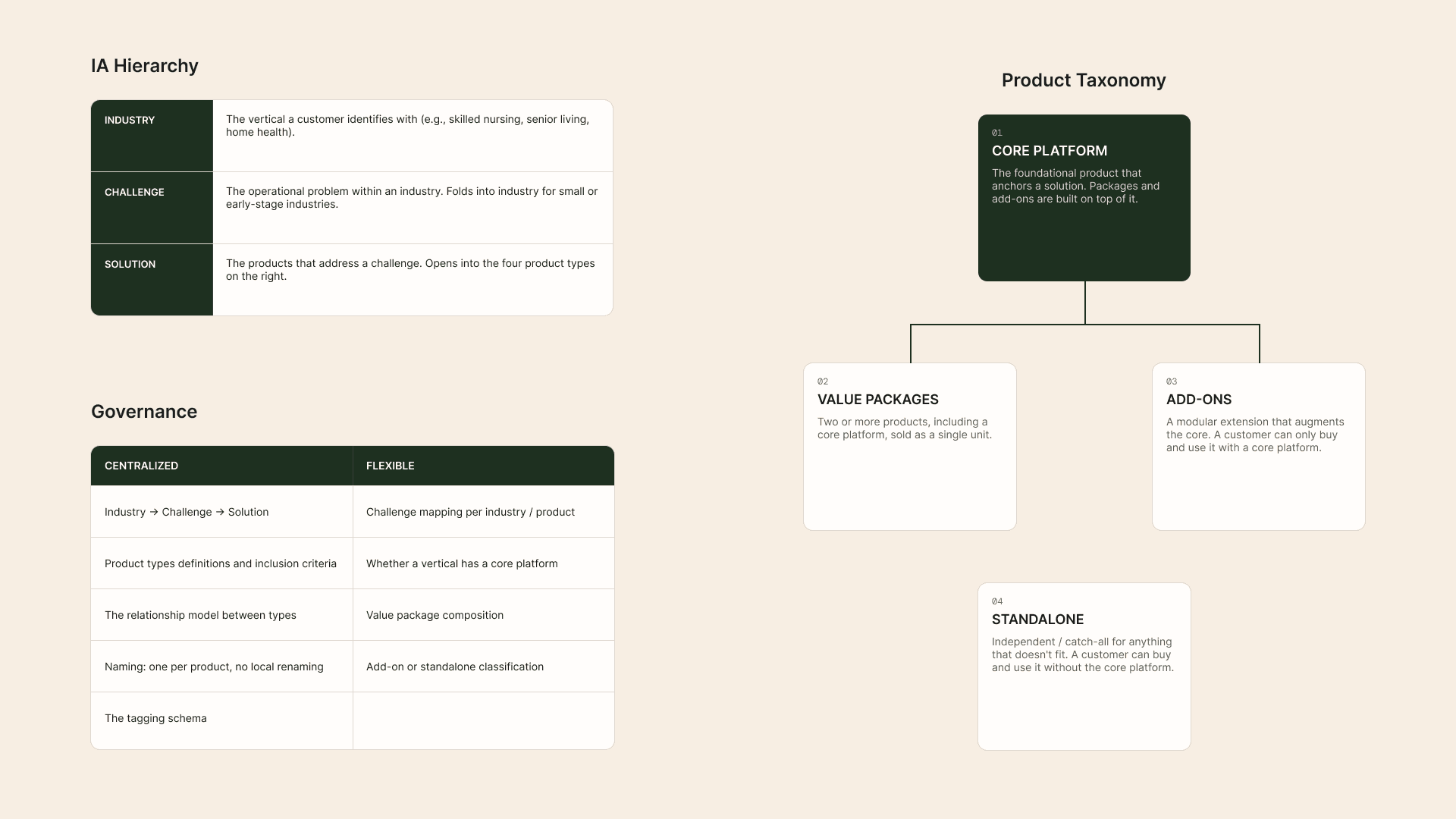
We defined a standardized product taxonomy that could be adjusted within guardrails. Bounded flexibility was the only way the model could survive across business units. But design was only half of the work. The harder part was socialization — landing it with the project team, then account leads, then the client contact, and finally the broader organization. We did it by always leading with principles before artifacts.
The signal it worked was when stakeholders began referencing the taxonomy’s language and logic unprompted. That alignment became the foundation everything else was built on.
Reframe 2: Industry segmentation to persona-informed flow
The existing structure organized content by vertical — skilled nursing, senior living, home health. That logic made internal sense but didn’t reflect how users actually moved through a buying decision.
Research identified four distinct buyer personas with fundamentally different relationships to a product. That shifted the work beyond industry-specific needs and toward a more useful question: what does “making a decision” actually mean for different types of users, and what does the experience need to provide for each of them?
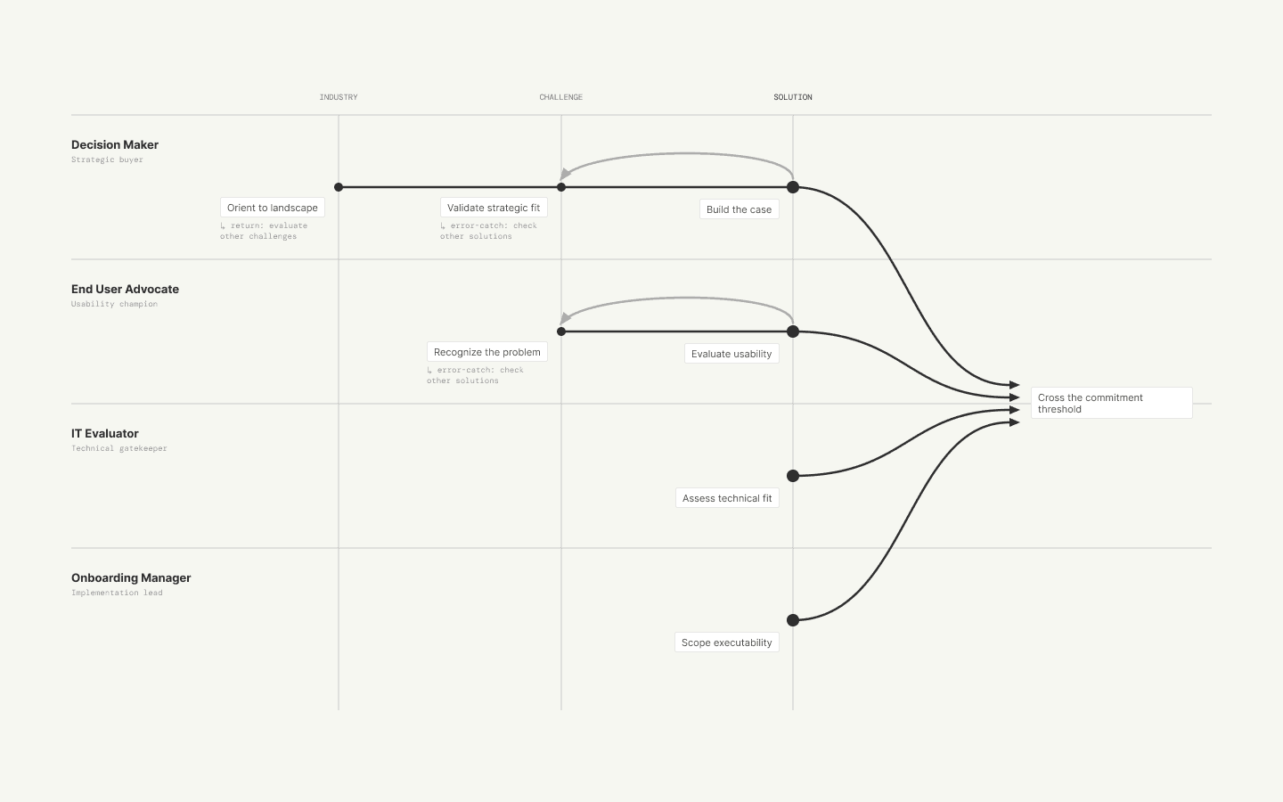
We kept the industry-based navigation at the top level because it was the entry point that matched the dominant user mental model. What changed was what each level is for and what content lives there.
Reframe 3: Marketing surface to decision system
With an organizational model in place and a clear picture of what different users need from the experience, another problem became visible: the website was only designed to broadcast product offerings. The buying process it needed to support was something else entirely. We had to design a system that empowered different stakeholders to evaluate and decide across multiple user sessions.
Stakeholders wanted product information and demo requests surfaced aggressively across the site. Research showed users weren’t ready to convert that early and disengaged when asked to. So the shift was to stage the ask to where someone actually was in their evaluation.

A meaningful signal came post-launch: the sales team was willing to reduce demo request friction by simplifying form fields and allowing users to schedule time proactively. We believe this came from hard-earned trust in the content system’s ability to qualify leads before the conversation.
System Design
Information architecture — an Industry → Challenge → Solution hierarchy that defined relationships between content types, applied the product taxonomy consistently across the ecosystem, and allowed structured flexibility for products and content outside the core framework.
Modular content components — page templates encoded the persona logic directly into the system. Each block served a specific user need, such as orientation, features, proof, or technical detail. CTA placement was sequenced by user readiness, and solution pages were structured to support multiple personas without collapsing into generic content.

Outcomes
Organizational adoption and scalability
Stakeholders adopted the taxonomy and framework in internal communication without prompting, but the more durable signal was what that made possible. The IA, taxonomy, and templates became the standing brief for ongoing site development. New pages were being built from the system without the agency in the room. The design outlived the engagement.
Improved lead quality
Sales trusted the content system to qualify leads upstream, and that trust changed the nature of early sales conversations. They reported that leads arrived better oriented to the right solution, reducing the clarification work that had previously defined first calls and helping conversations move more quickly into evaluation.
Content production efficiency
The template system eliminated per-page structural decisions and the stakeholder alignment cycles that came with them. Across approximately 120 pages built on the new templates, that removed an estimated 360–600 hours of design and review time for the client organization. This was time that could shift to content and strategy work rather than relitigating page architecture.
What I’d Push Further
One pillar of our UX strategy was behavior-based content personalization, but we descoped it from the initial build because we did not yet have enough confidence in user identification. Instead, I worked with an omnichannel strategist on a measurement plan for inferring user types from behavioral signals, along with feature concepts that could be designed and deployed once targeting confidence improved.
Beyond personalization is the demo request experience — the handoff between website and sales as a service design problem. With the organizational alignment now in place, there's room to redesign the end-to-end experience from discovery through conversion in a way that actually reflects how users buy.
A note on method: the most impactful moment in the project was recognizing that the presenting problem — "fix the navigation" — sat at a different level than its actual cause. That diagnostic move, and the tools I've built around it, are written up separately here.